Creating a responsive site for a beloved brick & mortar store

Established in 1994, Bija is a successful outdoor clothing company with over 400 retail stores and gear for all types of outdoor enthusiasts. They want to build an online store to make shopping more convenient and refresh the brand with a modern, neutral, and fresh look.
Create a new brand identity for Bija and a responsive e-commerce website that is easy to use and intuitive.
Design a site with the end user in mind and upgrade Bija’s brand identity for the modern consumer.
The first step was to uncover customers’ needs, desires, wants, and pain points for those who already were shopping online. To discover why I researched industry competitors, did secondary research, and conducted user interviews.
To cultivate understanding and align user goals to the final solution, I created an user persona and an empathy map.
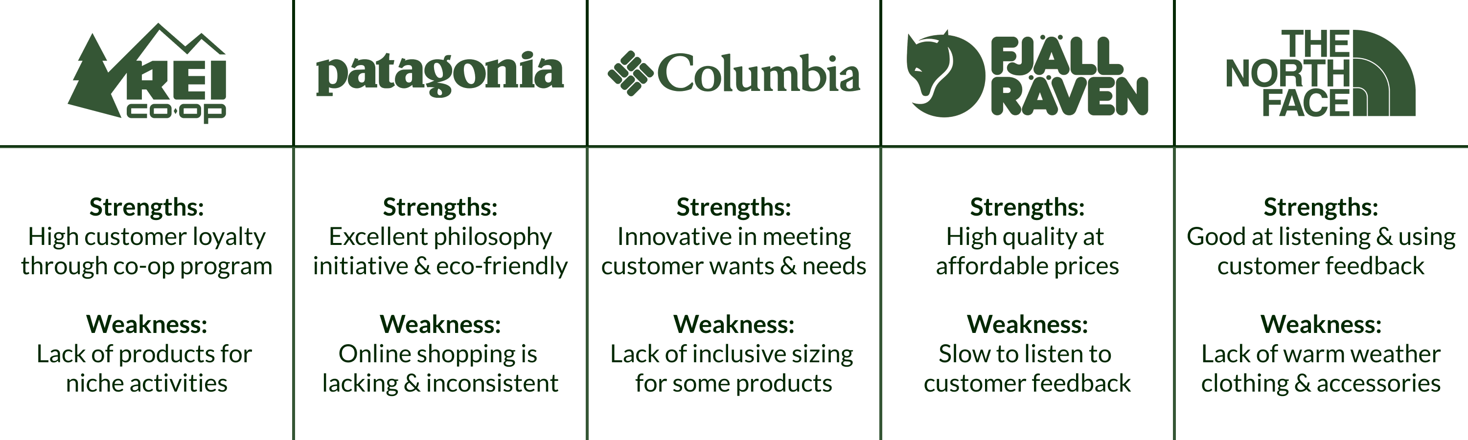
After identifying the strengths and weaknesses of Bija’s direct and indirect competitors, I decided to take a closer look at each competitor, including ease of use adding an item to the cart.
I found that users strongly prefer clear and prominent CTAs, and search and filter functions must be strong, simple, and concise.
To cultivate empathy for online shoppers, I conducted four 1:1 interviews to gain insight into their motivations, needs, and pain points.

Montana, ‘Monty’ is a servo engineer from Chicago. Though the price isn’t a concern, she is savvy about saving money. When shopping online, she's very conscious about what she buys and consumes but will maximize her purchase to save shipping costs. Monty is particularly picky about the aesthetics, ease of use, and simplicity of mobile usage.
To make sure we design the perfect e-commerce site for Monty, we need to make sure that it’s…

I created an empathy map that followed the lines of what my research uncovered to align design decisions and functionality to Monty better, and broadly, what my users were expecting.

Once I understood user needs and what motivates them to shop online, I next determined how to organize the website to make sense for users, follow established user patterns, and help achieve user and business goals.
One of the significant challenges of designing a robust e-commerce site is organizing the information architecture; how do we categorize, filter, and sort clothing items intuitively so that users aren’t hunting for an item in multiple categories?
To tackle this challenge, I conducted an open card sort exercise remotely via OptimalSort to see how people would sort a series of 30 cards of confusingly labeled clothing items. Nine people with no knowledge of the project participated in the exercise.

Before designing anything, it was essential to visualize Bija’s key pages and relate them to each other. Utilizing my card sort exercise insights, I categorized sections by Women, Men, Search, Account, Locations, and Checkout. All other elements are based on user interviews and other secondary research.

Click to view sitemap→
Task Flow: The task I focused on was how my persona would purchase an item, in this case, a jacket. I created a task flow that walked from the initial thought of buying a jacket through to checking the item out.
User Flow: Then, I moved on to a more comprehensive user flow for every possible action that a user could take to add an item to their cart, including check-out as a guest, new user, or returning user. I considered how specific pages could relate to each other and how a person could successfully navigate the site to purchase an item.
Because the main project goal is to implement a successful purchase flow, I focused on creating wireframes for crucial pages that would lead to a purchase.


The next step was to pull my sketches into Sketch and digitize them. Here, I started working on a grid, determined the type choices, built components and blocks, and selected icons that would later shape my UI Kit.


With Bija’s information architecture and hierarchy setup, it was time to jump into rebranding Bija and update the website's interface. To make sure Bija looked sleek, polished, and modern, I created a UI kit complete with design patterns to aid in the development and future iterations. Since Bija wanted a simple brand refresh, I designed a logo, prepared a mood board, and selected a new color palette and typography to match its brand voice and values.
Since Bija wanted a total refresh and brought their brand identity into a more inclusive, friendly, and modern tone, the imagery, typography, and color palette were refreshed. These design choices are based on user data who preferred a user-friendly, easy-to-read and visually appealing design.

Bija’s UI kit was created to simplify future design choices and aid in developing Bija's website as the company expands. The kit will also allow easy-hand off to developers to make new components and reference from.

After updating Bija’s brand identity and UI Kit, I applied the design elements to Bija’s home, category, and product pages. These hi-fi designs were created using Sketch and later implemented into a prototype using InVision.


With my prototype up and running, I tested my users to see what worked, didn’t, and pain points. I then gathered my user data and created an affinity map to see what overlapped, whether good, bad, or ugly. In utilizing an affinity map, I found what priority revisions were a must.
You are buying a women’s xs reddish knit sweater and adding it to the cart.
After completion, I compiled my research into a spreadsheet to see what concerns, frustrations, and observations overlapped. What I found out was:
Using the spreadsheet and to better understand my users’ concerns, frustrations, observations were urgent and most desired, I created an affinity map. I assigned a sticky note color to each user, jotted down meaningful quotes from my notes, and grouped them into three sections: What Worked, User Pain Points, and Secondary Pain Points.

By keeping my users in mind throughout the design process, I created a visually appealing and user-friendly product that put my user goals, needs, and wants at the forefront.
Instead of just creating a polished and pretty shell, I designed a site with actual function by creating a robust and customizable filter system that allowed users to navigate and purchase items quickly.
Even though Bija is a functional e-commerce site that merges users’ needs and wants with business goals, there is always room for improvement, especially with digital products. There will always be aspects and areas to improve on in the future. Some future considerations I would implement would be:


