An iOS app for outdoor nature lovers to organize their trips with others in real time.

The research phase started with talking to outdoor enthusiasts and people who enjoyed outdoor activities to understand their wants, needs, goals, and pain points on what they’re currently using.
My participants said that they use a variety of apps to coordinate all travel aspects. Sometimes one thing gets forgotten or overlooked because there was a communication breakdown. Another complaint my interviewees had was they wished there was a more collaborative way to send messages about media files. For example, one person interviewed said he shoots the Milky Way and other highly technical shots. He wishes there was a way to add GPS coordinates to the image without saving a location on a map and sending it to his buddies. Another interviewee said she would like an app to store pictures of her climbing gear and write notes about what needs repairs, replacement, and upgrades before setting off on her next climbing adventure.
The consensus of my user interviews was that they wanted an app that:
Next, I developed a user persona that represented the user feedback I gathered in the research phase. Referring back to this persona during the defining process helped me stay aligned to user goals and reminded me of the problems I need to solve.
Meet Archer; he is a marketing director based in Denver. He is an avid outdoorsman and loves finding cool new places and well-treaded stays. He is looking for a better way to plan outdoor trips with his friends.

With the persona fleshed out, I moved to figure out what Archer’s motivations, thoughts, actions, wants, and needs would be. This map allowed me to further align better with user goals and needs.

Next, it was essential to define how a user would interact with the app and its functions and the interface and formatting. Questions asked were:
I created a mid-fi wireframe of my key screens with Embark’s information architecture complete. Alongside interaction screens, I tested the wireframes on six users using InVision. After receiving feedback and implementing changes to the wireframes, I moved on to the design phase.
The objective of Embark’s branding was not to draw attention to the brand itself but rather be the backdrop. User-generated content is at the forefront, allowing users to customize how they want to plan their outdoor trip.
The UI kit brings together a sense of wonder and awe to the design system. The sans-serif typeface evokes a warm friendliness that is both legible and inclusive. The brand colors pull from the brilliant sunsets in the canyonlands and mountainscapes. The interface will be simple, clean, and adhere to a grid. This structure allows users to organize their thoughts and media files neatly and easily invite friends to collaborate.


With Embark’s brand identity and UI kit established, the next step was to kit out the hi-fi wireframes and use the revisions from testing the mid-fi prototypes.


I created a prototype using InVision and conducted usability tests using Maze to test the hi-fi wireframes. Sixteen users participated in the usability test. I devised three tasks encompassing Embark’s target audience and monitored the results.
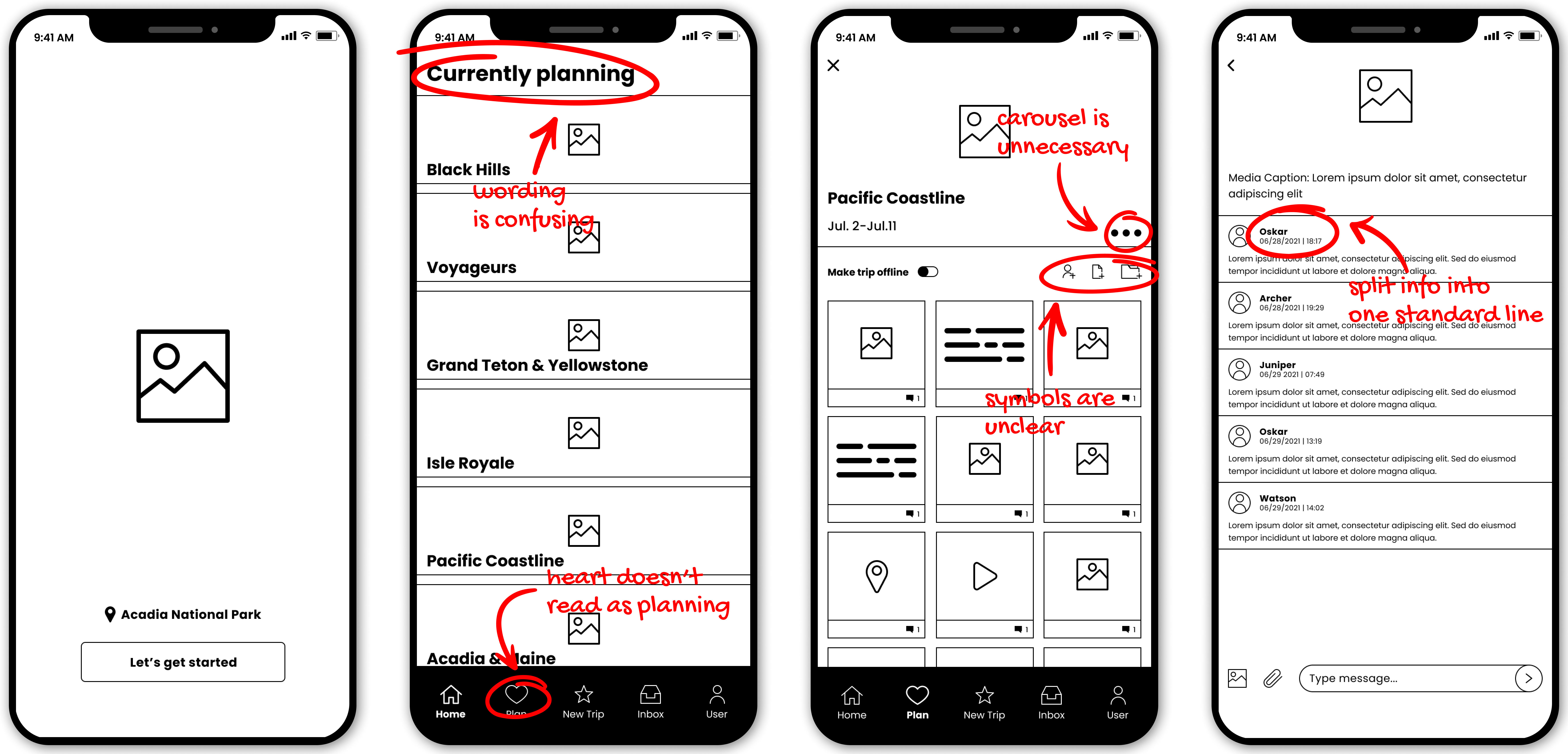
You are traveling to the Pacific Coastline and might lose cellular service on the trip. You want to save your trip offline so you can see your itinerary without worries.
Find the mentioned trio and toggle it to be viewed offline.
The test was successful because the design was consistent with previously learned behaviors in regards to this request.
You're going on a trip to Voyageurs National Park. Your friend Diego commented on the houseboat image. You need to reply to his comment.
Find the described image and add a comment.
Again users reported no issues since this was a straightforward task. The only question raised was how users would be aware of notifications. The solution would be the inbox icon in the bottom nav having a notification bubble pop up, which was not functional in this prototype.
Part 1: You’re planning a trip with your friend Poppy. You want to invite her to the Embark app so you can plan the trip together.
Find the mentioned trip and toggle it to be viewed offline.
PART 2: There’s a Smokey the Bear statue you want to see on the trip.
Find the described image and pin it to the board.
There was confusion in completing this two-part task. The main frustration with this task was navigability; to solve this issue, the following steps would be to create a tutorial overlay for each new screen a user visited to explain the different functionalities and how to best use Embark.


